Managing energy is important, but is difficult without energy information which is accessible, timely and meaningful.Data is automatically collected from ‘smart’ (interval) electricity and gas meters, and the data stored in the eco-tracker database, which is hosted in a secure data centre in Brisbane, Australia. Genesis Now developed eco-tracker to provide energy users with access to energy consumption data. We have taken the eight chart types which we have found most useful in managing energy during the last 21 years. To view a chart, you simply select from drop-down lists, the;
- site (where a user manages the energy multiple sites),
- the specific billing meter or sub-meter (e.g. electricity, gas, water),
- the chart type (see below), and
- the period.
Rather than spending time creating charts in a spreadsheet, your time can be better spent reviewing charts of energy load profiles and trends, building an understanding of how energy is used, and identifying and evaluating energy efficiency opportunities.
eco-tracker has a number of valuable features that allow your organisation to reduce costs and utility consumption:
- Online secured access (24/7)
- Flexibility to report on any utility type
- Automated upload of utility data (using FTP)*
- Automated upload of eco-tracker supplied meters
- Automated upload of data from building and industrial automation systems
- Weekly performance report via email
- Graphing of consumption including:
- Hourly/daily/weekly/monthly/yearly consumption
- Comparing multiple meters
- Comparing multiple time periods
- Comparing hourly consumption with local temperature hourly profiles
- Manual upload of any data (Site Administrator only)
- Manual data entry of daily readings (Site Administrator only)
- Manage meters (add, rename, delete) (Site Administrator only)
- Maintain account details
- Ability to import NEMMCO standard file format
Here are the main graph types provided:
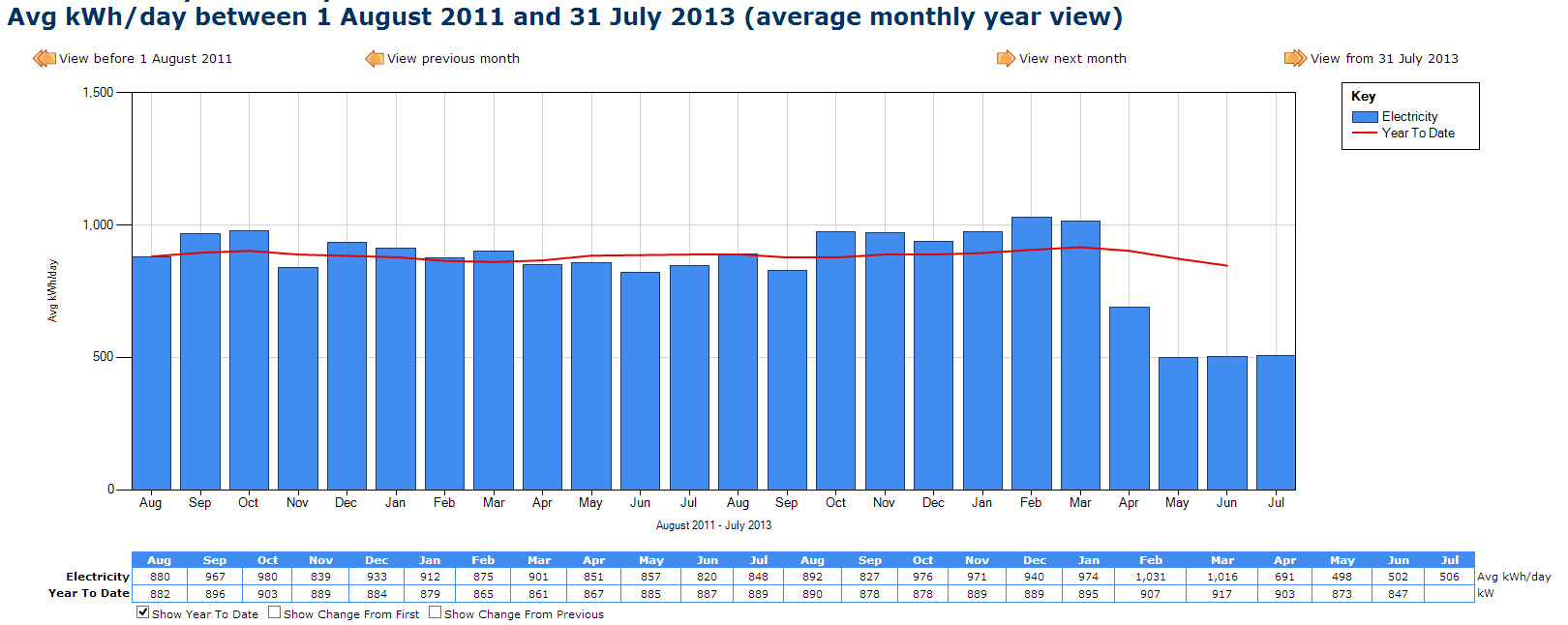
Yearly chart (actually up to 2 years), showing average daily consumption each month, and year-to-date average.
This chart is great for seeing seasonal patterns, and the year-to-date (YTD) trend line makes it each to tracking progress in reducing energy use.

Monthly chart, showing average consumption each day. This chart is particularly good at highlighting the magnitude of energy use on weekends compared with weekdays.
Like all eco-tracker charts, there are convenient buttons for navigating forward or back one day or one month, or jumping up a level to the year view.
The table under the chart shows the total energy use each day. The chart and / or the table under the chart can be copied to the clipboard.

1-Day chart, shows the average consumption, each hour, from mid-night to midnight, for one day.
This chart makes it easy to visualise consumption patterns.
1-Day chart (and ambient temperature), this is the same as the preceding chart type, with the ‘view temperature’ option box checked.
This option will automatically display the ambient temperature each hour, for the closest Australian bureau of meteorology automatic weather station.
This chart hows the average consumption, each hour, from mid-night to midnight, for one day.
With this chart, you can quickly get an idea whether it was reasonable for the heating or cooling to be operating.
7-Day chart, this is chart we use the most. It quickly conveys the pattern of electricity, gas, etc. consumption over a week, and highlights issues such as base-load, after-hours consumption, anomalies in start-up and shut-down procedures.
The eco-tracker screen and other options
The above charts show just the main features.
The eco-tracker user interface provides easy access to a wide range of viewing options, comparisons between meters, between charts, and the ability to jump back and forward in time.
Automatic email alerts.
Having all these great charts available for analysing electricity, gas and water consumption patterns won’t help to reduce costs, if nobody looks at them.
And it would easy to forget to look at them each week, because you are so busy.
So we provide the option of an automatic weekly email (to whoever you chose, and as many people as you want).
This allows the Environmental Manager, Energy Manager, Factory Manager, etc. to quickly see if consumption is tracking according to plan.
The email reports on the average daily consumption for each meter (including virtual meters) for the week just finished, and compares this figure with the preceding week, and with the corresponding week one year earlier. For convenience, increased consumption is highlighted in red, and reduced consumption is highlighted in blue.
To discuss how eco-tracker can be applied in your situation, to achieve your energy management goals, please Contact Us
